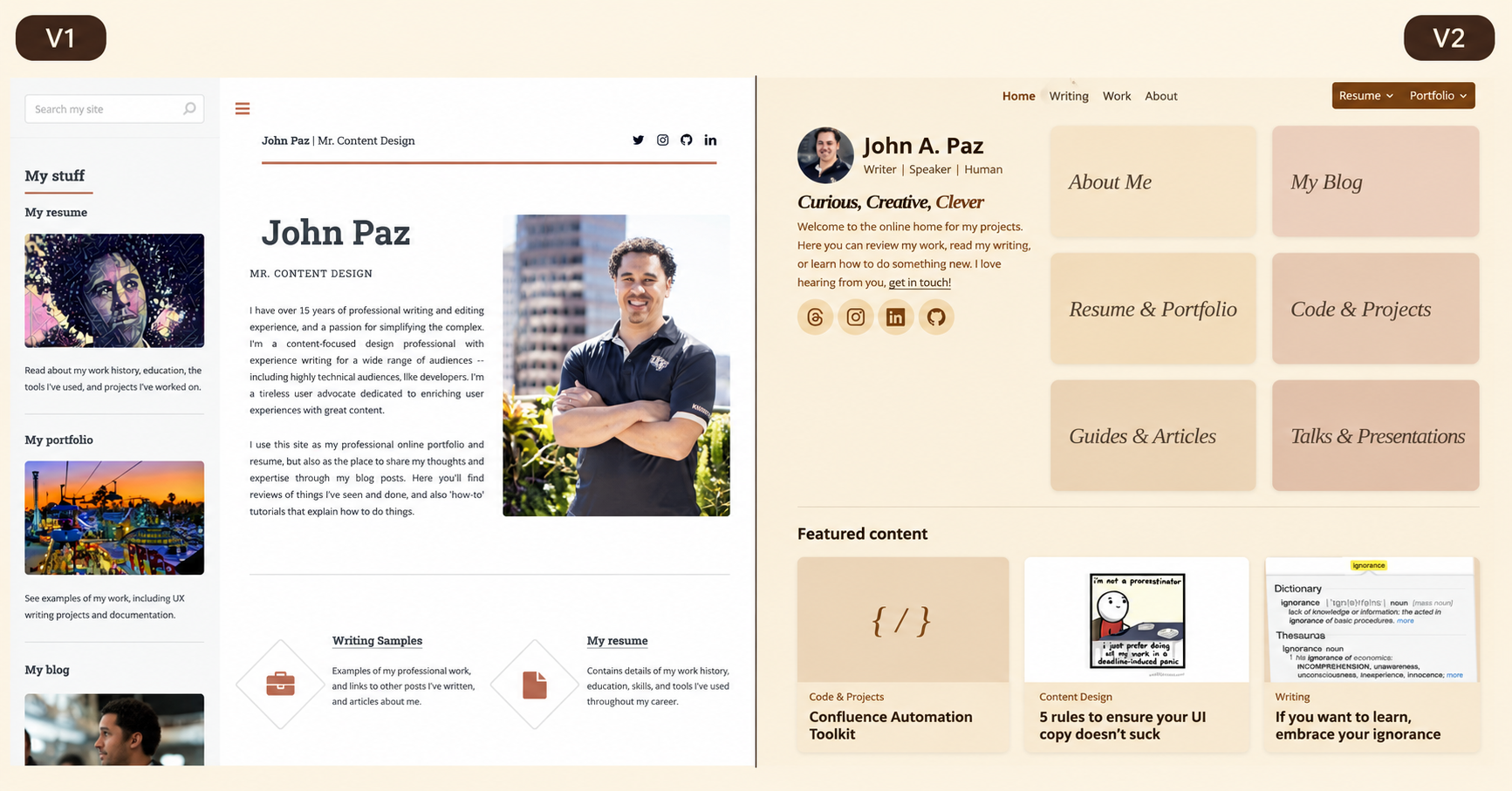
My website has a new look—and a much better way to explore what I do.
JohnAPaz.com is now home to a refreshed portfolio, a more useful work history, my writing, coding projects, talks, and a little more of the person behind all of it. If you’ve visited before, you’ll recognize some familiar material. This time, it has room to breathe.
I wanted a place that felt like me: curious, creative, and interested in making complicated things easier to understand. The old site did a job. This version gives the different parts of my work a clearer place to live—and gives me a reason to keep adding to it.
More than a fresh coat of paint
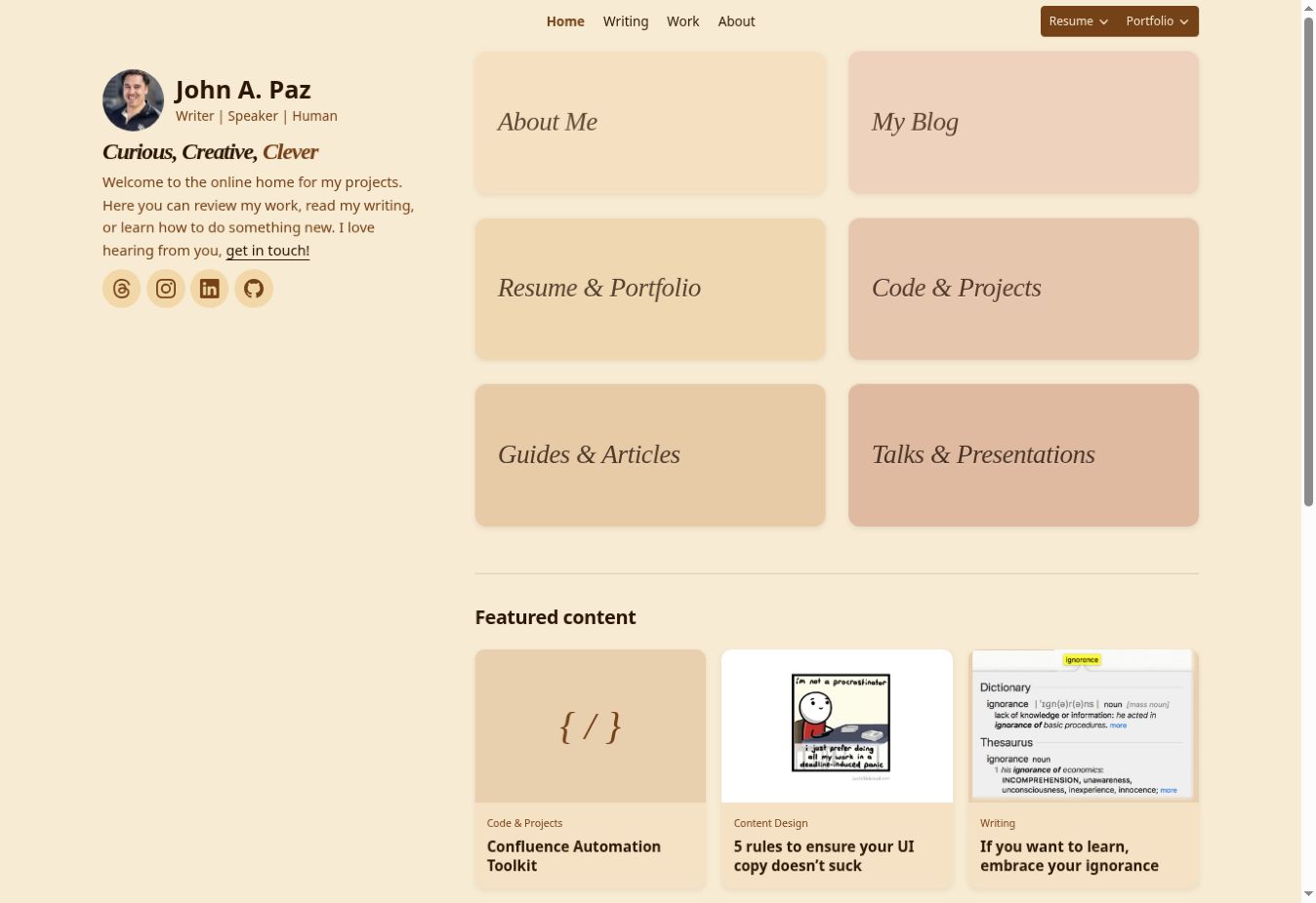
The homepage now gives you six clear starting points. There’s a warm canyon-inspired palette, subtle raised tiles, and a quieter layout that lets the work do more of the talking. I spent more time than I expected thinking about small things: how a label feels, how much space a toolbar deserves, and whether a button still behaves when the screen gets narrow.
The work history has become a better way to understand the problems I’ve helped solve. You can explore experience by chronology, kind of work, industry, and tools. My UCF degree also gets the space it deserves. Go Knights.
Articles and guides have a browsable catalog, while the blog has a simpler reading flow. Coding and projects bring together the things I’ve built and the stories behind them. And the talks and media archive gathers presentations, podcasts, interviews, and press that had been scattered across the web.
Recovering that archive was its own reminder: publishing something doesn’t mean you’ll always be able to find it later. Some recordings are no longer available. I’ve tried to make that clear rather than send you hunting for a video that isn’t there.
Building with AI still meant making decisions
I used AI as a collaborator throughout the redesign: exploring options, implementing pages, troubleshooting, and helping document the work. That let me move quickly, but it didn’t remove the need for judgment.
I supplied the purpose, references, palette direction, content priorities, and feedback. Some implementation choices were delegated. Others needed several rounds of correction. At one point, asking for smaller tiles produced smaller labels instead. A useful reminder that even a seemingly straightforward design instruction can carry an assumption you haven’t made explicit.
The process became a loop: describe the goal, look at the result, test it, and get more precise. Screenshots and real feedback were essential. “The build passed” and “this feels right on my phone” are different pieces of evidence.
That’s also why this post includes an AI-assistance disclosure. I want to make the contribution visible: whether AI helped with editing, structure, or substantial drafting. A made-up percentage wouldn’t tell you much. A short description of its role is more useful.
The staging site mattered as much as the design
Before pushing the redesign live, I set up a separate staging site. It gave me a place to try changes, share previews, and inspect them without replacing the production site every time I wanted to move a button.
The source stayed in GitHub. Feature branches gave each change a reviewable home, and the v2 branch brought the accepted work together. The staging repository could publish that integration branch or a selected feature branch. Each published preview recorded the source branch and commit, so I could check what was actually on screen.
GitHub Actions provided continuous integration—CI—to build the Jekyll site and check the output. Preview builds disabled analytics and discouraged search indexing. The release work also added checks for internal links and assets. Those checks give me a repeatable baseline; browser review still has a separate job.
This was an incremental rebuild on the existing Jekyll and GitHub Pages foundation. Keeping that foundation meant I could improve the experience while preserving useful content and familiar URLs. The wiki became the record of requirements, decisions, and the backlog instead of leaving all of that in a conversation.
The small problems were real work
The challenges weren’t limited to writing code. Staging had its own DNS and HTTPS trouble. Navigation that looked tidy on desktop could wrap awkwardly on mobile, especially on a folding phone. Download menus needed to stay readable without wandering off the edge of the screen. Even metadata needed attention so links and social previews pointed to the right place.
Working through those details made the site better, and it made the process more useful to me. I could see where automation helped, where my instructions needed work, and where only looking at the result would answer the question.
I’ll write a separate, deeper walkthrough of the implementation and what I learned. For this announcement, the point is that the redesign also gave me a better way to maintain and publish the site.
What comes next
I want to keep this home useful: add writing, share practical resources, document projects, and recover more of the talks and interviews I’ve done over the years. There’s room for continued work on search, accessibility, performance, and the everyday experience of finding something worth reading.
I also want to share the process honestly—what I decided, what I delegated, what worked, and what needed another pass. The repository and project wiki are part of that story.

Come have a look
Be sure to check out the new site. Pick a section that catches your curiosity, read something, or see what I’ve been building. If we’ve worked together, you may find a familiar project or two.
And if something makes you think—or something doesn’t work—tell me. I’d love to hear from you.